Bellafina Website and Logo Design
SERVICES
- Logo Design
- Website Design
- Copywriting
Bellafina Chocolates is a one-of-a-kind nonprofit. Founded in 2010, they make artisan chocolate truffles and donate 100% of the proceeds to charities that support at-risk children and women. They also offer an employment program for women who are overcoming barriers, supporting them in rebuilding their lives and gaining skills.
Every part of their mission, from the delicious chocolate to the charitable contributions, makes the world a better and sweeter place.
The Ask
A Sweet and Purposeful Rebrand
The Bellafina team is deeply dedicated to their mission of supporting women and children. After expenses, each penny earned is donated to their charitable partners to fund essential work around the world. They had never worked with a design agency, choosing to do everything themselves.
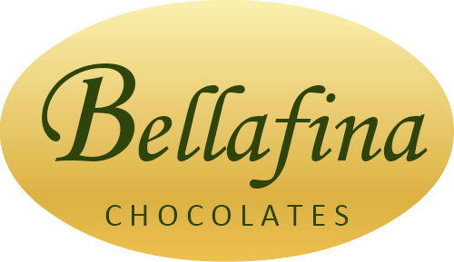
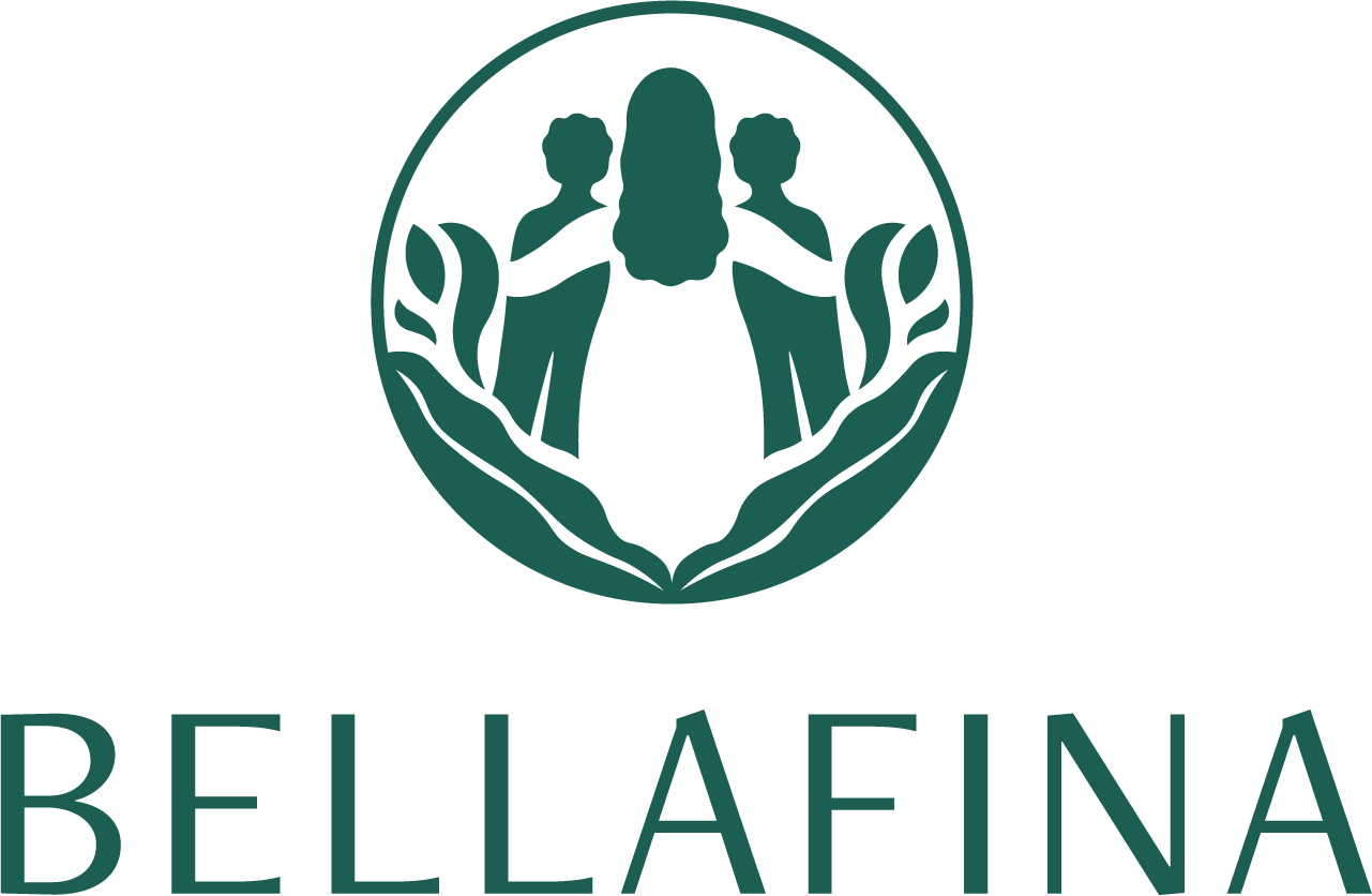
After 13 years of creating chocolate to support women and children, the Bellafina team saw an opportunity to grow their impact through strategic and elegant visual branding. They offer a luxury product and needed an updated logo and website so that they could stand out on the shelves of boutiques and shops.
BEFORE
After
Our Approach
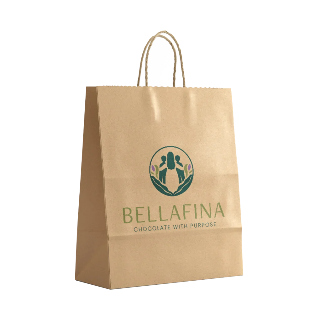
The Logo
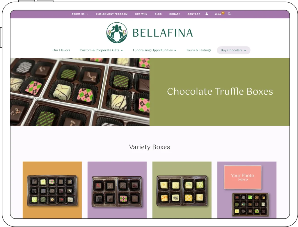
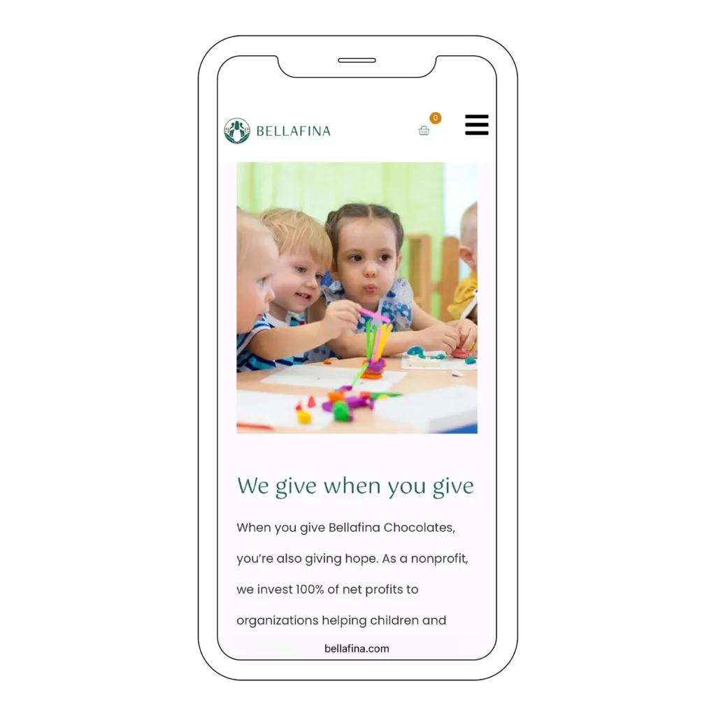
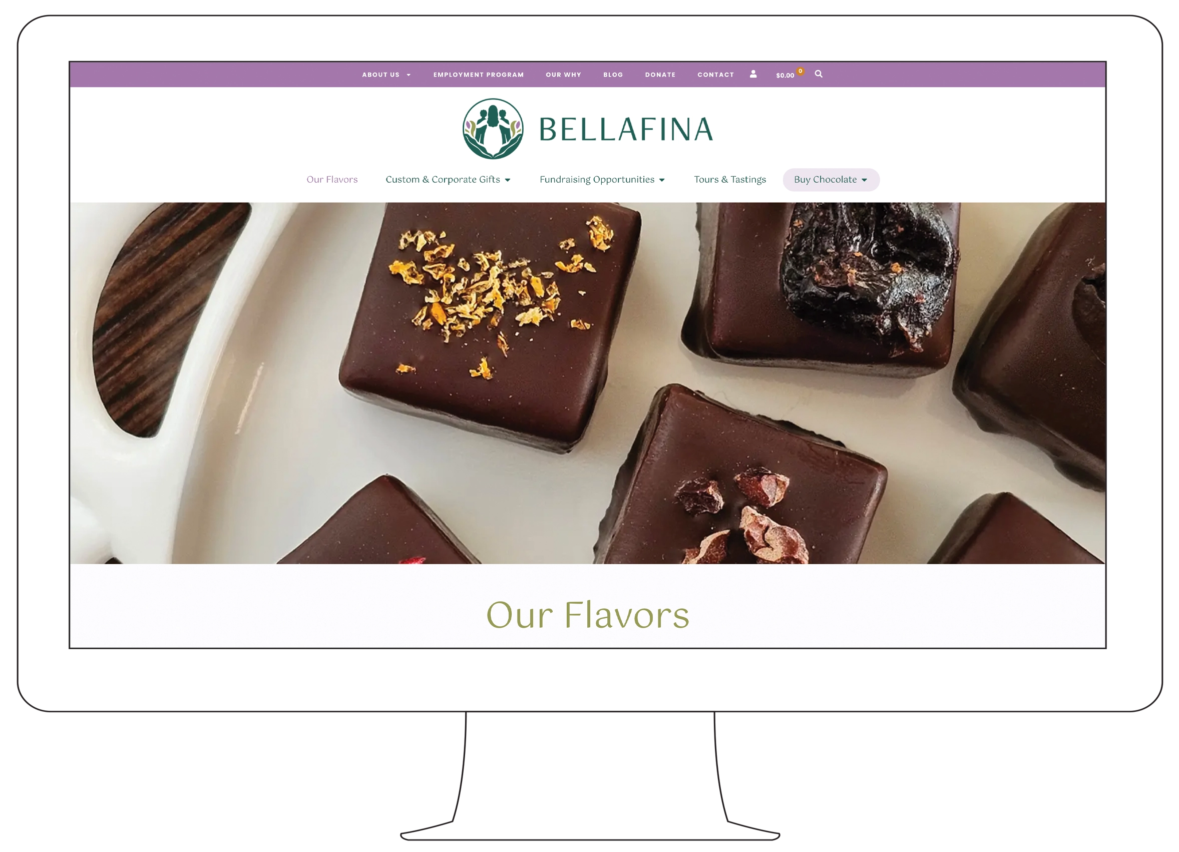
The Website
Bringing it all together
The Results
a sweet success
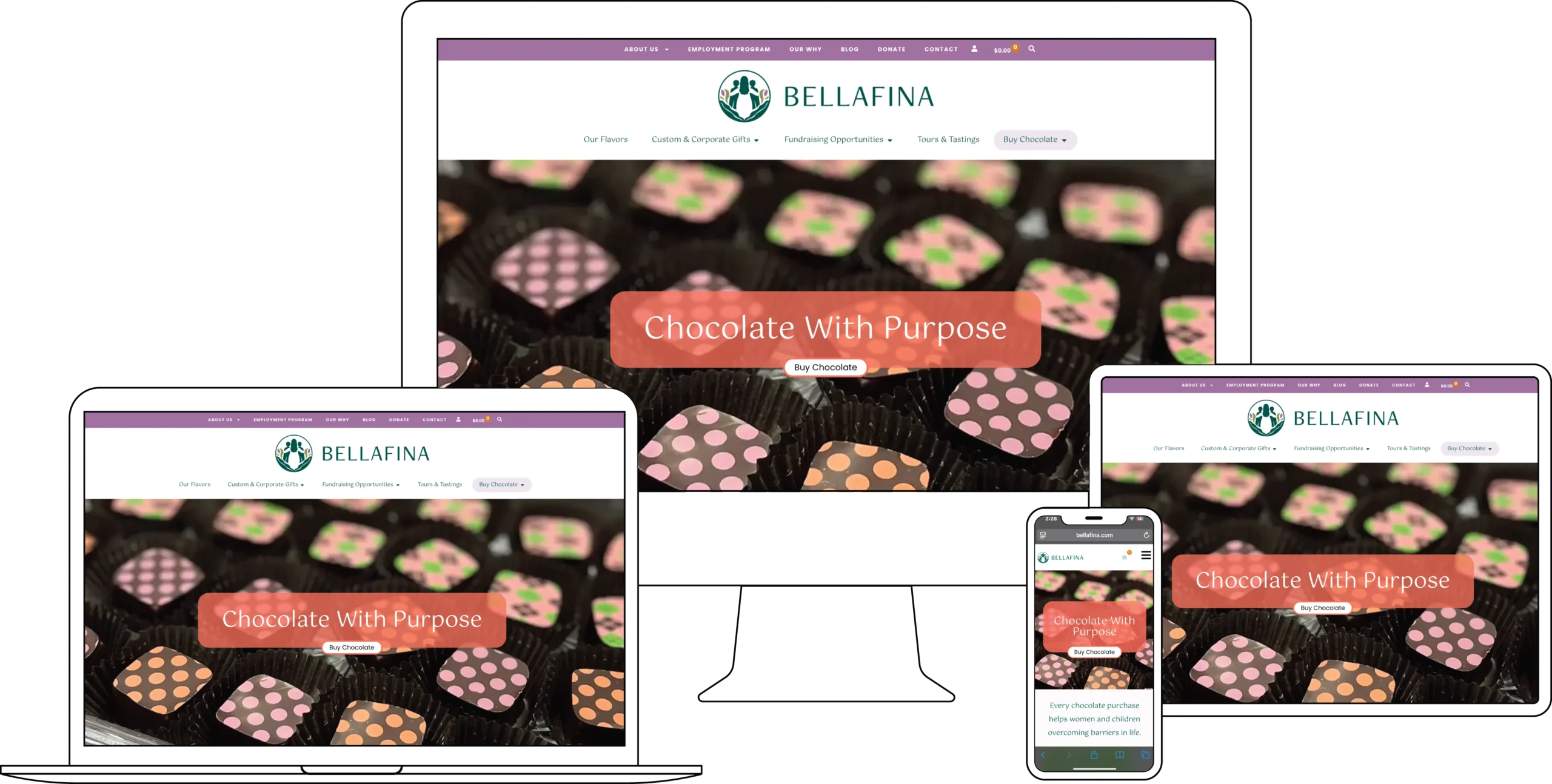
Since launching the new brand, the Bellafina team feels proud to send people to their website, knowing that the updated logo, colors, and photography authentically share the story of Bellafina and the meaningful work they do. Additionally, the new website is much easier for both staff and customers to use. Women participating in the Bellafina employment program are trained in various aspects of order processing using the e-commerce site. This helps Bellafina run more smoothly while providing additional job skills and experience. All around, a sweet success!

“Never in my wildest dreams did I imagine our website could capture our mission and products so perfectly, but Hillhouse Creative made it happen. From day one, they listened deeply, guided with compassion, and delivered with excellence. Their clear communication, attention to detail, and steady presence brought me real comfort and brought my vision to […]
“Never in my wildest dreams did I imagine our website could capture our mission and products so perfectly, but Hillhouse Creative made it happen. From day one, they listened deeply, guided with compassion, and delivered with excellence. Their clear communication, attention to detail, and steady presence brought me real comfort and brought my vision to […]

