Case for Support Design for Healing Hands Health

SERVICES

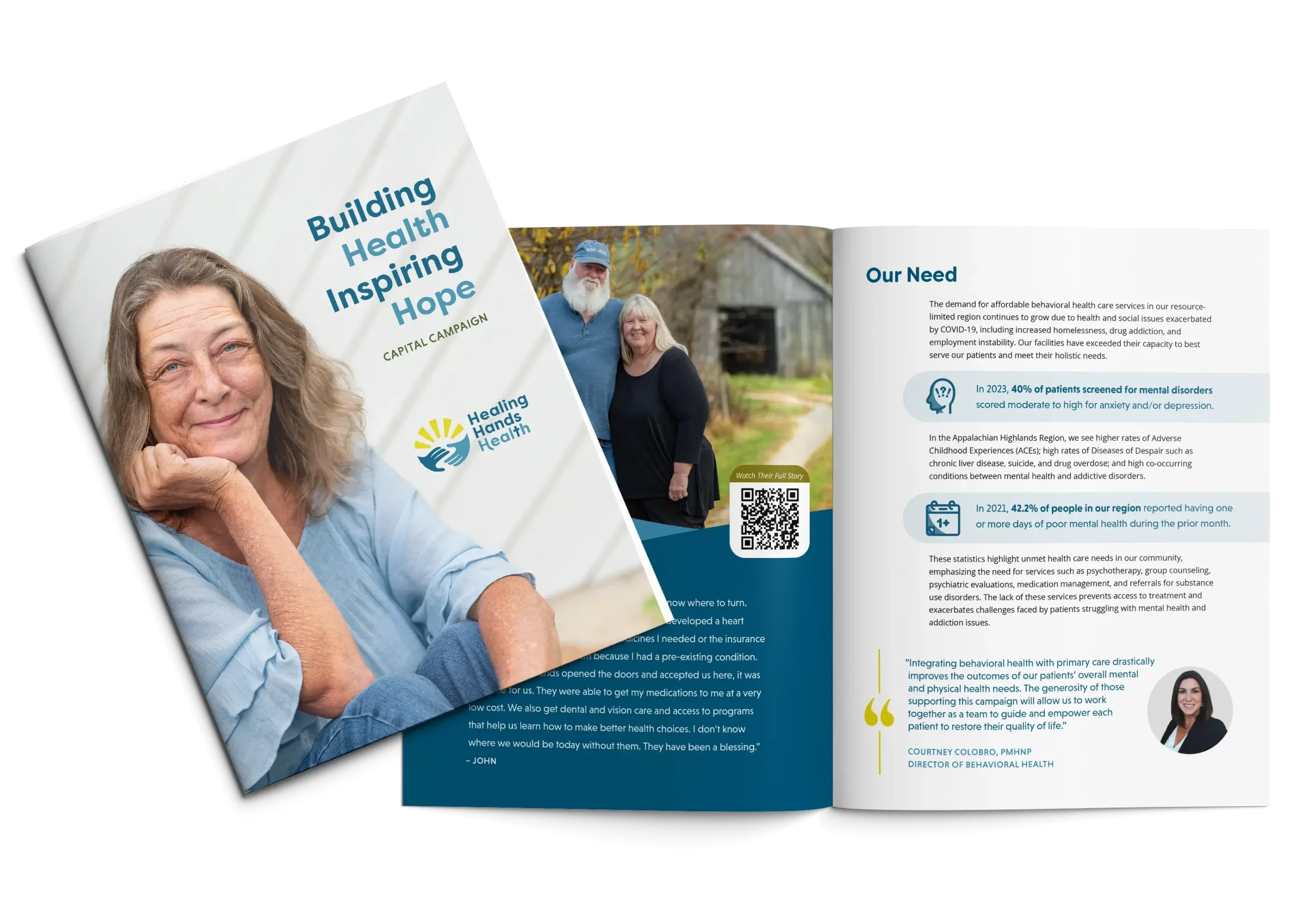
The Healing Hands Health Case for Support and an inside spread. The cover shows a middle-aged white woman who is smiling with her lips closed. The title is "Building Health Inspiring Hope." The inside spread shows a photo of an older white couple who are smiling and text.
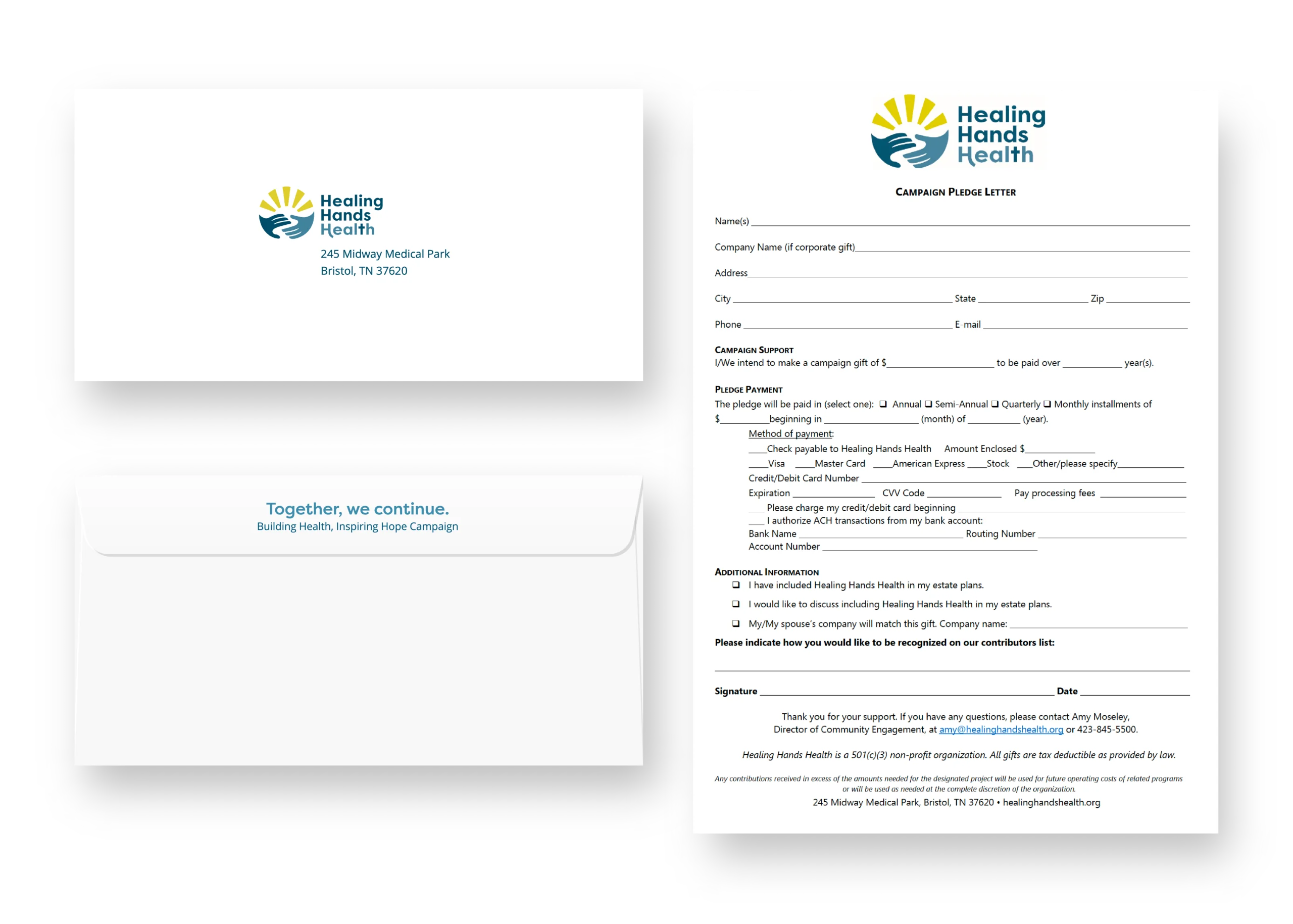
Two envelopes and a giving form for Healing Hands Health.

The Ask

expanding healthcare

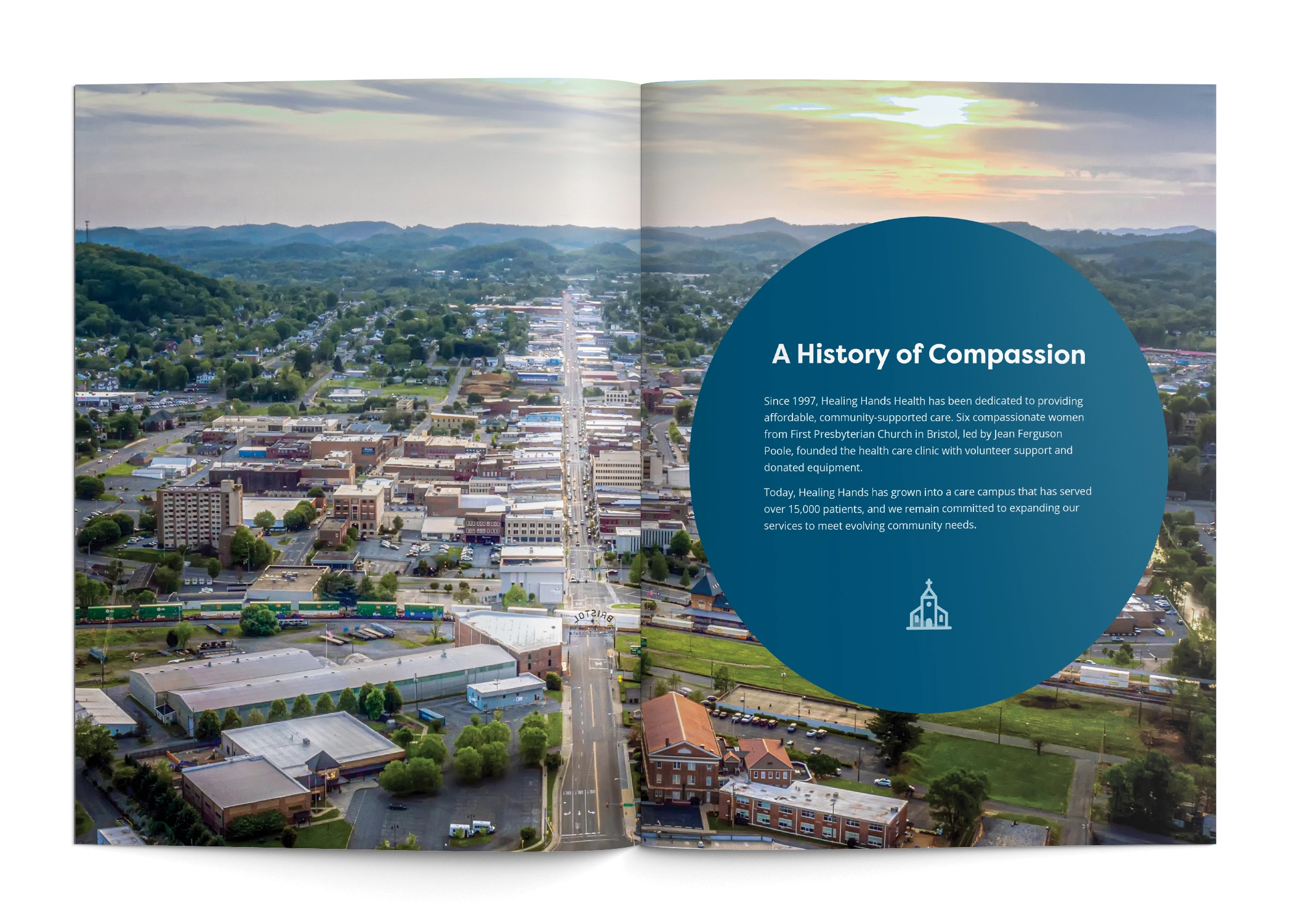
A spread from the Healing Hands Health Case for Support shows an arial photo of Bristol TN/VA with a blue circle with white text on top.

Our Approach

clarity, trust, connection

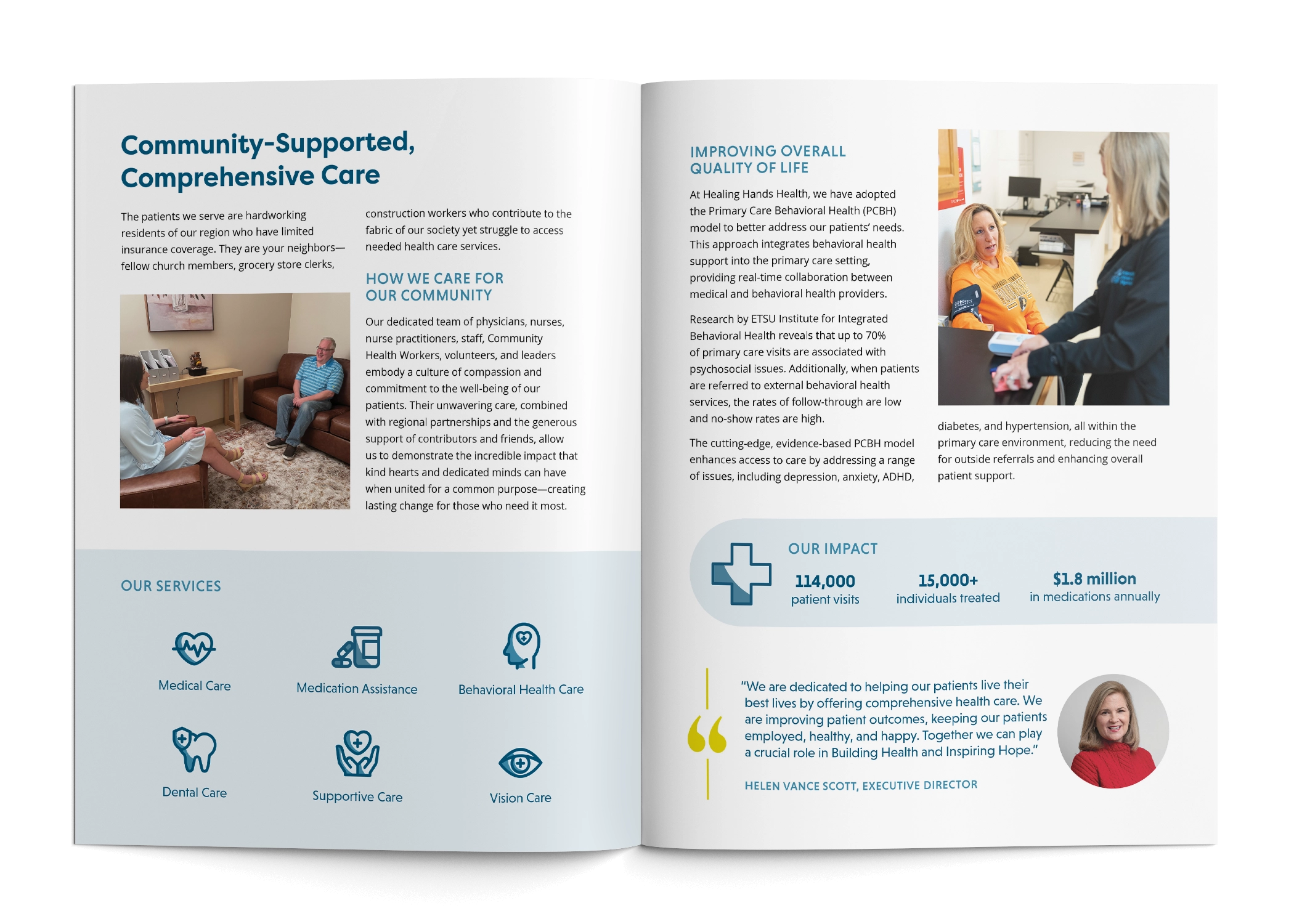
The spread of the Healing Hands Health Case for Support shows a mix of copy, icons, stats, and photos to show the impact of the organization.

The Results

Subtitle

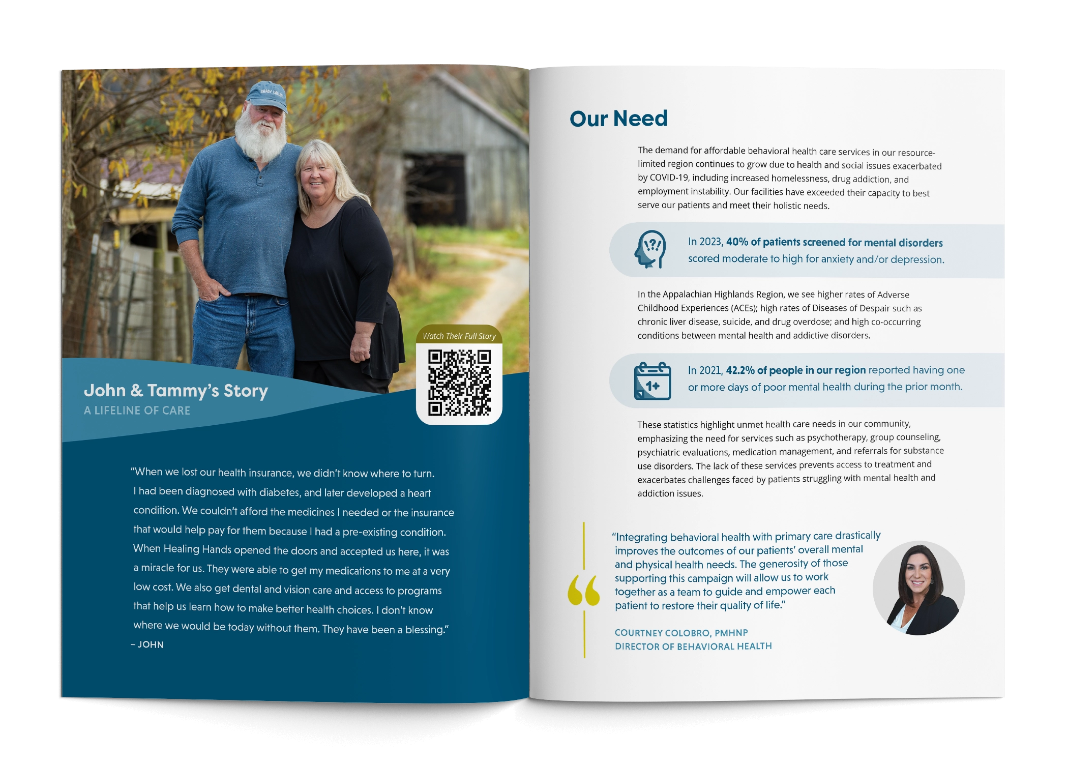
A spread from the Healing Hands Health Case for Support shows a picture of a middle aged white couple, Josh and Tammy, on the left page and their story. On the right page, there is text and a quote from the Director of Behavioral Health with her headshot.
Headshot of a brunette woman in a pink shirt.

“Hillhouse crafted a Case for Support for our capital campaign with graphics and a narrative that beautifully conveyed the story we wanted to share. We were extremely pleased with how the materials truly captured our vision and expressed it effectively.”

“Hillhouse crafted a Case for Support for our capital campaign with graphics and a narrative that beautifully conveyed the story we wanted to share. We were extremely pleased with how the materials truly captured our vision and expressed it effectively.”

Jodi Kemple
Director of Marketing and Communications
Healing Hands Health

View other work

90th anniversary logo design for United Way of Greater Kingsport, featuring the commemorative anniversary mark displayed in a floral centerpiece.

90th Anniversary Logo Design for United Way of Greater Kingsport

Anniversary logo design for United Way of Greater Kingsport, celebrating 90 years of service. Inspired by the rolling hills and mountains of Northeast Tennessee, the commemorative mark was designed to complement the organization’s existing visual identity.

peopleinc color

People Incorporated Color Refresh

People Incorporated felt that their core and secondary palettes no longer reflected their brand. They came to us for recommendations on an updated color palette that would be flexible, vibrant, and better represent their friendly, helpful, community-oriented personality.

Hillhouse Creative Logo