10 Simple Nonprofit Website Updates You Can Make Today

10 Simple Nonprofit Website Updates You Can Make Today

Like a house with good bones, your nonprofit website can function well for years without major renovations. But just as a home needs occasional upkeep to stay in top shape, regular nonprofit website updates are essential to extend its life and keep it running smoothly.

Without consistent care, a small leak can turn into a ruined roof—and similarly, a minor outdated element on your site can negatively impact your visitors’ experience. In fact, 38% of people will stop engaging with a website if the content or layout is unattractive.

Meanwhile, over 52% of nonprofit website traffic now comes from mobile devices, yet many sites still aren’t optimized for a smooth mobile experience. That means missed opportunities to connect with donors, volunteers, and community members—especially when they’re engaging on the go.

Your website works tirelessly for your organization, day and night. To ensure it continues to serve your mission effectively, here are 10 questions to help guide your routine nonprofit website updates—so that everyone who visits feels as welcomed and supported as they would in your home.

Image of top of website in reference to nonprofit website design

1. Does your homepage headline explain who you are or what you do?

Your hero section (top portion) on your nonprofit website needs to communicate to your viewers who you are and how you can help them. Ideally, you want your visitors to know what you are about in the first 10 to 15 seconds. Get rid of ambiguous copy that doesn’t communicate your story quickly.
Image representing how sliders are bad in reverence to nonprofit website updates.

2. Are you still using sliders or pop-ups?

Sliders were all the rage years ago. Now, not so much. Sliders aren’t SEO-friendly, and they don’t work well on mobile. They’re distracting and take away from the initial explanation of who you are and what you do. Pop-ups are also distracting, especially on mobile devices. If you must use a pop-up, make it an exit-intent pop-up that reacts only when someone is about to leave your website.
In reference to nonprofit website updates this image points out getting rid of social media icons in your header.

3. Are there social media icons in your header?

Social media icons in your header are gateways for people to leave your nonprofit website before they’ve even started absorbing your content. Ditch links in your header that take your user away from your website, and place them in the footer instead. Your website should be the hub of your online presence; your social media should feed to it, not away from it. Consider using social media sharing buttons that allow visitors to share your content on their social media pages without taking them away from your site.
This is an image that shows websites on different devices in reference to nonprofit website updates

4. Is your nonprofit website mobile responsive?

If your website was designed within the last five years, chances are you can check this box “done.” Most of the newer website templates are responsive out of the box, especially if you’re using WordPress or Squarespace.

That doesn’t mean all of the content or elements you have on your site are responsive, though. Even with a newer site, it is wise to check and see how your site looks on mobile, tablet, and desktop devices.

If it’s been more than five years since you designed your nonprofit website, definitely take time to look at it on all devices. If your website doesn’t work on mobile or tablet, you’re probably losing out on traffic. Not only do nearly half of users access sites on their phones, but Google rankings also give preference to websites that are adjusted for mobile.
This image symbolizes typography in reference to nonprofit website updates

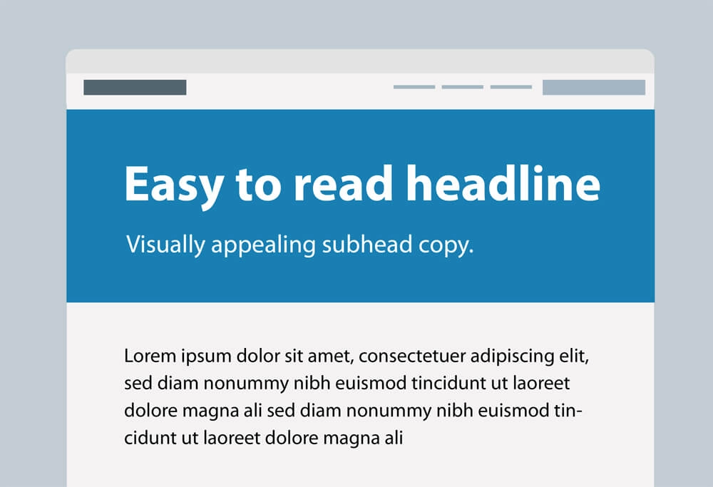
5. Is your typography easy to read?

A good starting point for your body copy is 16-point type. You can go down to 12 points if you are using a very readable font, but ideally, 16 or higher is best. For headlines, a good rule of thumb is to base the headline size off your body copy size to create a nice contrast. If you have 16-point type, double that to 32 points for the subhead, then double again for the headline size, to 64 points.
This image represents website flow in reference to nonprofit website updates

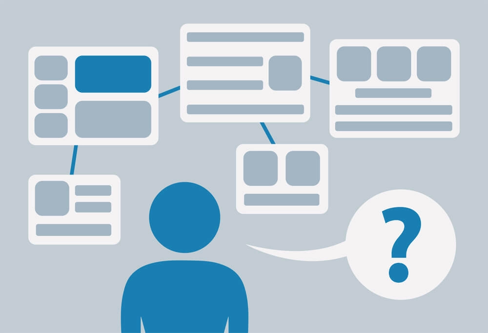
6. Does your nonprofit website flow well?

Direct your viewers where you want them to go. Navigation should be easy to understand and viewers should feel at ease using your site. Review your website to see if there are any places where a viewer might get stuck or question, “where is X?” You can also get some great insights by asking a new user to navigate your website while you watch.
This image talks about not using obvious stock photos when referencing nonprofit website updates.

7. Are you using obvious stock photos?

Photos of people shaking hands, people in suits in conference rooms, and other staged photos come across as inauthentic. Photos should feel real and not staged. If you must use stock photos, try to find images that feel natural and candid. Graphics and illustrations are also good alternatives!
This images symbolizes getting rid of email links in reference to nonprofit website updates

8. Are you using email links in your content?

While it may seem like a great idea to include your email link in your content, email links can be security risks. With many bots on the internet, it makes it easy for spammers to get your email. Instead, consider a simple email form. It’s safer, trackable, and allows you to store the submitted data.
This image symbolizes not using pdfs for content in reference to nonprofit website updates

9. Are you relying on PDFs?

Many websites rely on PDFs in place of actual content. You might have a services brochure or an event flyer that were created for print, then you uploaded them to your site instead of using active text and photos or artwork. If your nonprofit website has a lot of content in PDF form, replace that with actual web content. PDFs are not ideal for the web and are not SEO-friendly. Real words on your pages can be read and understood by the bots you want to speak to—search engines that read your content and list your site for users who are searching for that information.
This image symbolizes not using robotic text in Calls to action in reference to nonprofit website udpates

10. Do your call-to-action buttons feel robotic?

The default call to action for any button on a website is “submit.” Unfortunately, “submit” is a horrible call to action. It’s vague, impersonal, and comes across as robotic. Take a look at your buttons and get rid of the robotic “submit” call to action.

Instead, make your call-to-action buttons more personable by writing your call to action in the first person. Let your button answer the question, “What do I want to do?”

For example, “I want to _______”:

  • Donate Now
  • Get Involved
  • Become a Volunteer
  • Team Up

If your nonprofit website ticks any of the above boxes, it’s a great time to do some light remodeling! Your website is open even when your office is closed, working even when employees are out sick, and answering users’ questions even when you’re busy. Making sure your nonprofit website is fulfilling the needs of your online visitors is an important factor in your organization’s success.

Share this article.
Facebook
LinkedIn
Email

View other insights

Image that represents nonprofit website redesign.

Nonprofit Website Redesign Guide: Refresh or Rebuild?

Is a nonprofit website redesign the right move—or can a simple update do the trick? Find out how to evaluate your site’s needs effectively.

5 Benefits of Being Transparent with Your Nonprofit Marketing Budget

You don’t have to go posting your marketing budget on social media for all the world to see. But sometimes, sharing your budget with the right people is absolutely necessary.
Hillhouse Creative Logo