Virginia Highlands Community College Wolf Logo

wolf logo vhcc

It’s been 20 years since Virginia Highlands Community College introduced its Wolf mascot. Originally designed by Nikelle Hagey, the logo has served as an inspiration to the students at VHCC to give them a sense of identity. The logo inspired the naming of their on-campus snack bar, the “Wolves Den.” It was also the inspiration for several campus literary publications.

The administration decided to give the logo a facelift and a more modern iconic look and called upon Hillhouse Creative to put our logo skills to the task.

vhcc wolves
thehowl

It always starts with the sketches.

Every good logo begins with a pen on paper. Or, in this case, with Apple Pencil on an iPad. The freedom to explore and try new ideas in a simple sketch is often overlooked. In this case, art director Matthew Childers took to his iPad to sketch out a few concepts to gauge the look and feel the client was going for based on their initial comments and thoughts.

This approach allowed us to quickly serve up some concepts to get a sense of the direction we needed to go.

The first concept.

Though striking and powerful, this first sketch was quite a bit more illustrative than the finished product.

A bit too cute.

This initial concept turned out to be a little too cartoony and cute, but was fun and added to the variety of ideas we wanted to present. It gave us an option that was endearing as opposed to aggressive.

We really liked this one.

Sometimes an idea comes along that you just have to push and develop. The graceful shape of the mountains in the logo almost perfectly matches the back of a wolf lying down. While this wasn't the final logo chosen, it has been asked of us to keep exploring this and to perhaps bring it into the fold as an alternate logo at some point.

The simple silhouette.

This concept wasn't one of our favorite initial sketches, but there was something to it. It was a start, but was far too complex and needed refinement. The simple silhouette shape intrigued the client and was the direction chosen for us to explore further.

Cleaning up the look.

After receiving feedback from VHCC, we knew where to go. We moved ahead simplifying the look and experimented with various color treatments to add visual interest and depth. We also explored other profile options and how the wolf integrated with the VH logo.
initial wolves

Exploring nuances and refinement.

With a silhouette selected, it was time to refine the wolf. We took away any typography and focused just on the icon itself. In the video below, you’ll see how the Wolf silhouette evolved, starting with a dark blue coat of fur, transitioning to more of a white wolf with a light blue gradient, and then how we integrated typography back in with many typographic variations.

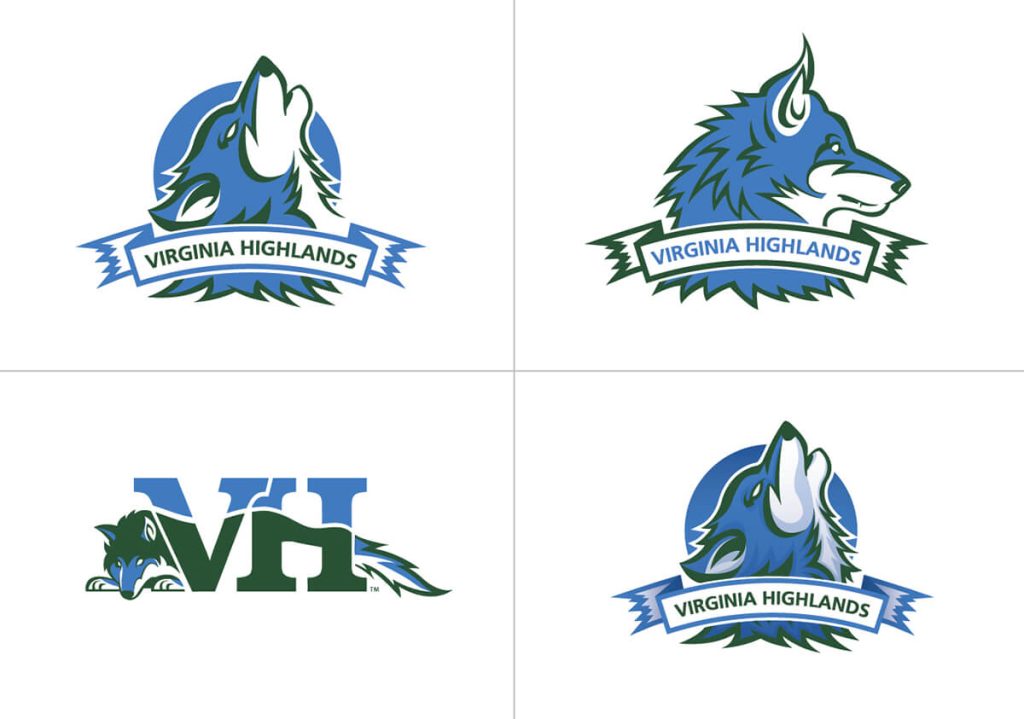
Here you can see all of the different variations from the video.

Logo Grid

The final mascot and its many variations.

The final set of changes to the mascot were subtle. The angle of the head shifted slightly and the wolf’s eyes were adjusted. Because the mascot icon would need to work on many different applications, we created several different lockups of the mascot.
wolf logo icon

The mascot in use

We are simply thrilled to have helped Virginia Highlands upgrade its mascot. Even more exciting is seeing how they are putting their mascot to use.

We also had a hand in helping VHCC obtain an actual mascot costume for use at their events.


Nikelle Hagey, the designer of the original Wolves logo presenting the new logo.

And finally here is a cool video and photo of the Wolf logo being engraved by Johnnie Keene.


“Hillhouse Creative is my first choice for all things creative! Not only are we provided with an over-the-top customer experience, the end result is always a ‘Wow!’”

“Hillhouse Creative is my first choice for all things creative! Not only are we provided with an over-the-top customer experience, the end result is always a ‘Wow!’”

Kellie Crowe
Former Public Relations & Marketing Director
Virginia Highlands Community College

View other work

Kingsport Cultural Arts Website

To reach their goal of reinvigorating the local arts scene, Kingsport Cultural Arts needed a revitalized website. The organization wanted the refreshed site to house information about their exciting new programs and initiatives, build anticipation in the community, and support their vision of Kingsport Cultural Arts as the epicenter of an invigorated cultural arts community.

Northeast Tennessee Tourism Association Airport Signage

The Northeast Tennessee Tourism Association (NETTA) needed a way to grab the attention of travelers going through the airport and encourage them to consider Northeast Tennessee for their next day trip or vacation.

@2025 Hillhouse Creative All Rights Reserved.
Hillhouse Creative Logo

Book A Call

Sign up for our newsletter.