
Our Work
We’re driven by the impact our clients are making.
And we’re proud of the work we’ve done together. These case studies will help you explore how we work with our clients, what we do to help nonprofits succeed, and how we may potentially partner together.
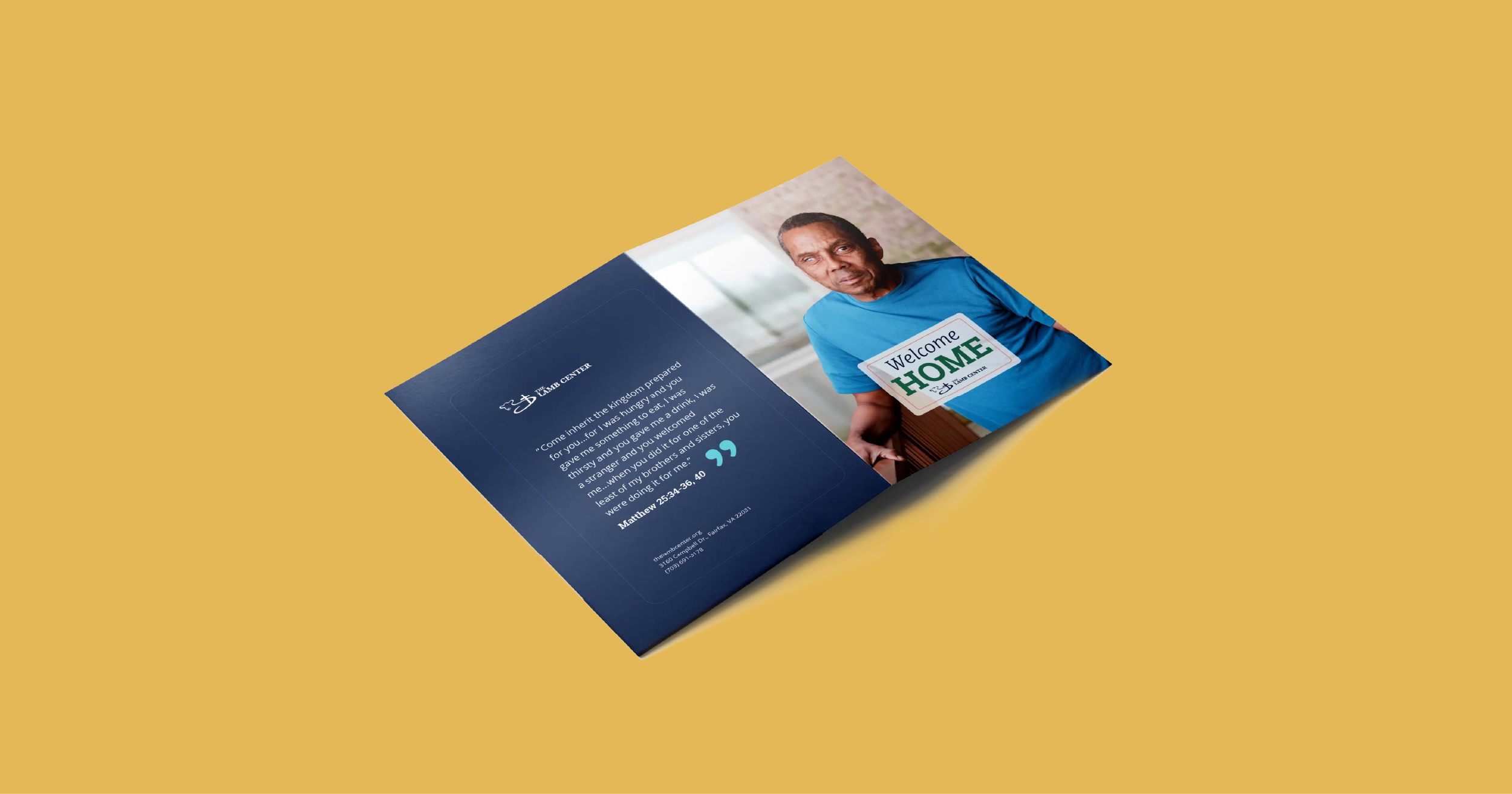
The Lamb Center Case for Support
Guided by The Lamb Center’s values of inclusion and compassion, we designed a case for support honoring the dignity and humanity of every guest. By showcasing custom photography and personal stories, we highlighted the lives changed through The Lamb Center’s service.
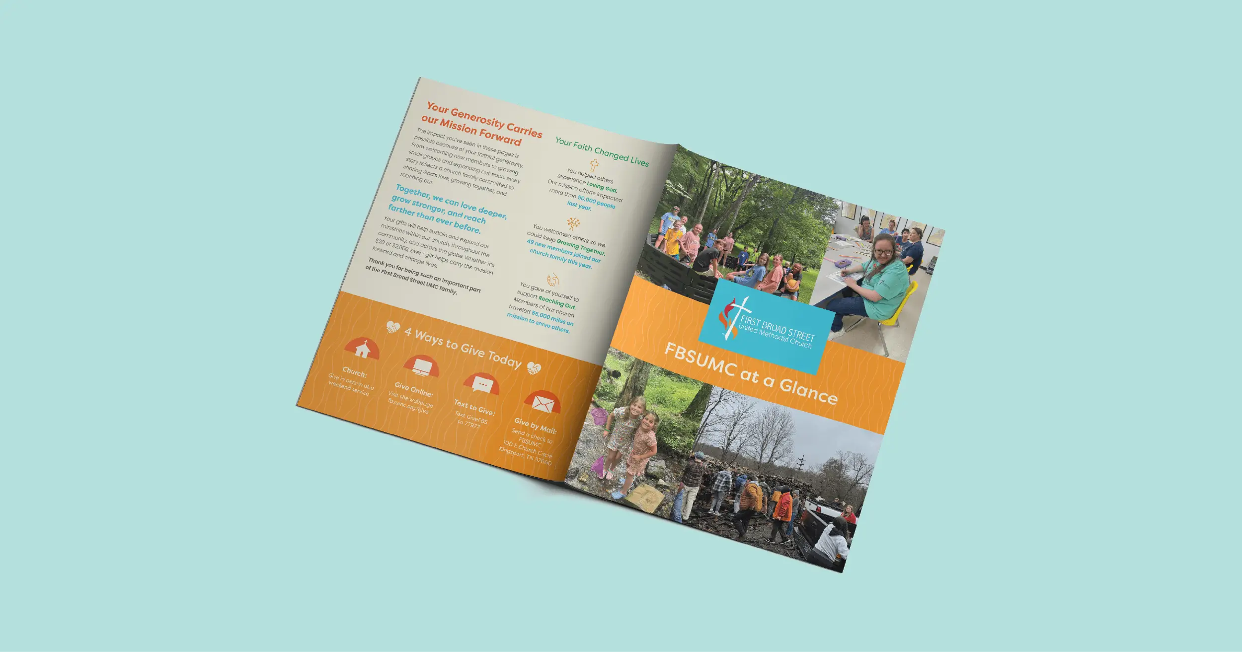
First Broad Street United Methodist Church Annual Report
With their annual report, First Broad Street United Methodist Church in Kingsport, TN, wanted to share the impact of their ministries. By using bold colors, eye-catching stats, and fun imagery we created a dynamic piece that was shared with their congregation and used for fundraising.

Health Wagon 2022 Gratitude Report
For their 2022 Gratitude Report, the Health Wagon wanted to share the heartwarming stories of people whose lives had been saved or greatly improved due to the care they received from the organization. By focusing on these patients’ stories, the Health Wagon is able to show donors exactly how their support helps them make a real impact for real people.
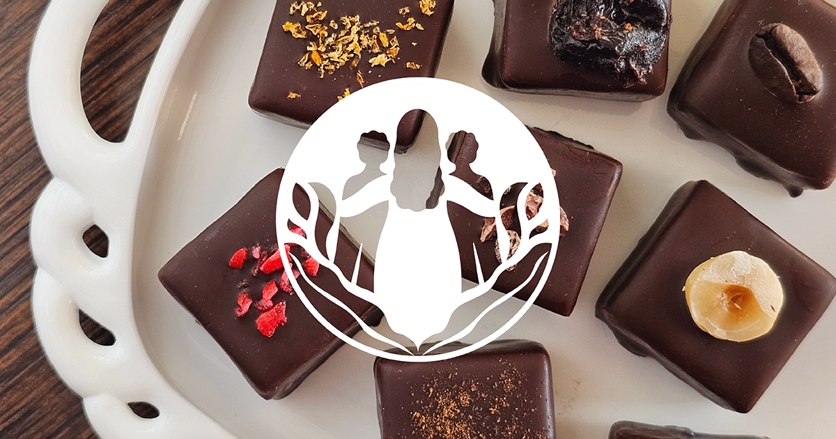
Bellafina Website and Logo Design
Bellafina Chocolates is a one-of-a-kind nonprofit. Founded in 2010, they make artisan chocolate truffles and donate 100% of the proceeds to charities that support at-risk children and women. Together, we designed a custom logo and e-commerce website to further their impact.
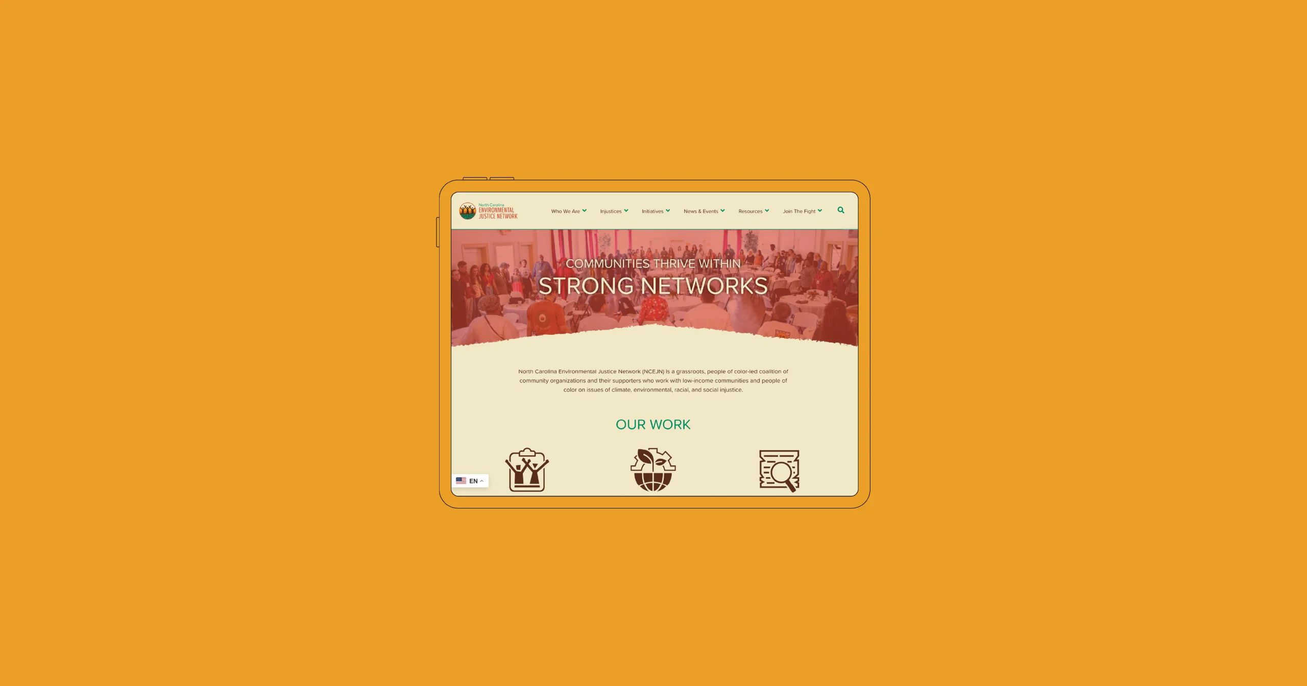
North Carolina Environmental Justice Network Website and Logo Design
As they celebrated their 24th anniversary, the North Carolina Environmental Justice Network wanted an updated logo and website that honored their roots, the work they do, and the future they fight for. Working together, we collaborated on a new logo and website that serve as a digital hub for environmental justice advocacy.
Family Crisis Support Services Website and Visual Branding
During a period of growth, Family Crisis Support Services recognized the need for a stronger visual identity and online presence. Together, we set out to create a refreshed logo and a mobile-friendly, SEO-optimized website that conveys inclusivity and support for survivors of domestic violence, sexual assault, and homelessness. The new site makes it easier for the community to understand the issues and get involved.
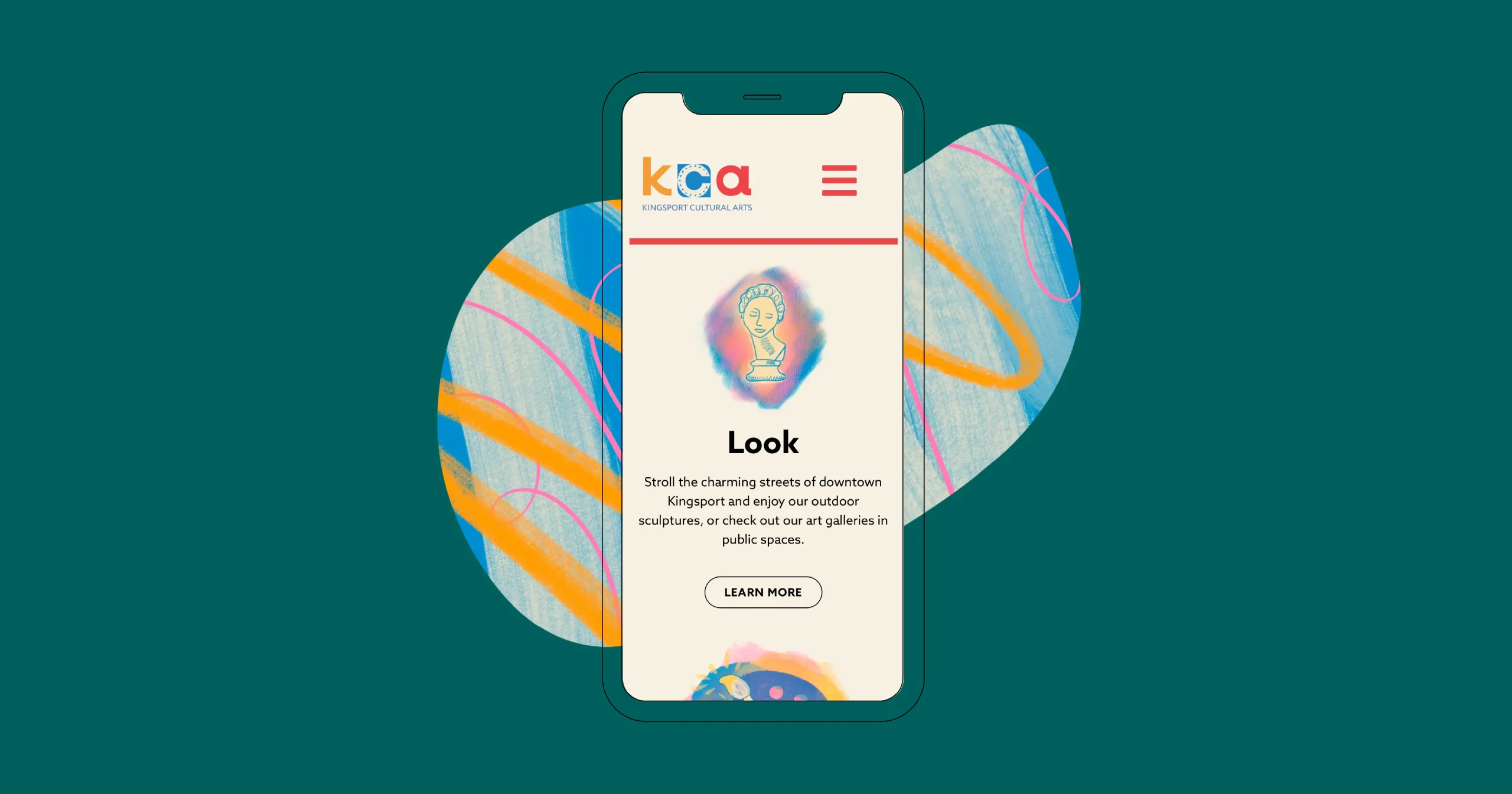
Kingsport Cultural Arts Website and Logo
To reach their goal of reinvigorating the local arts scene, Kingsport Cultural Arts needed a revitalized website. The organization wanted the refreshed site to house information about their exciting new programs and initiatives, build anticipation in the community, and support their vision of Kingsport Cultural Arts as the epicenter of an invigorated cultural arts community.
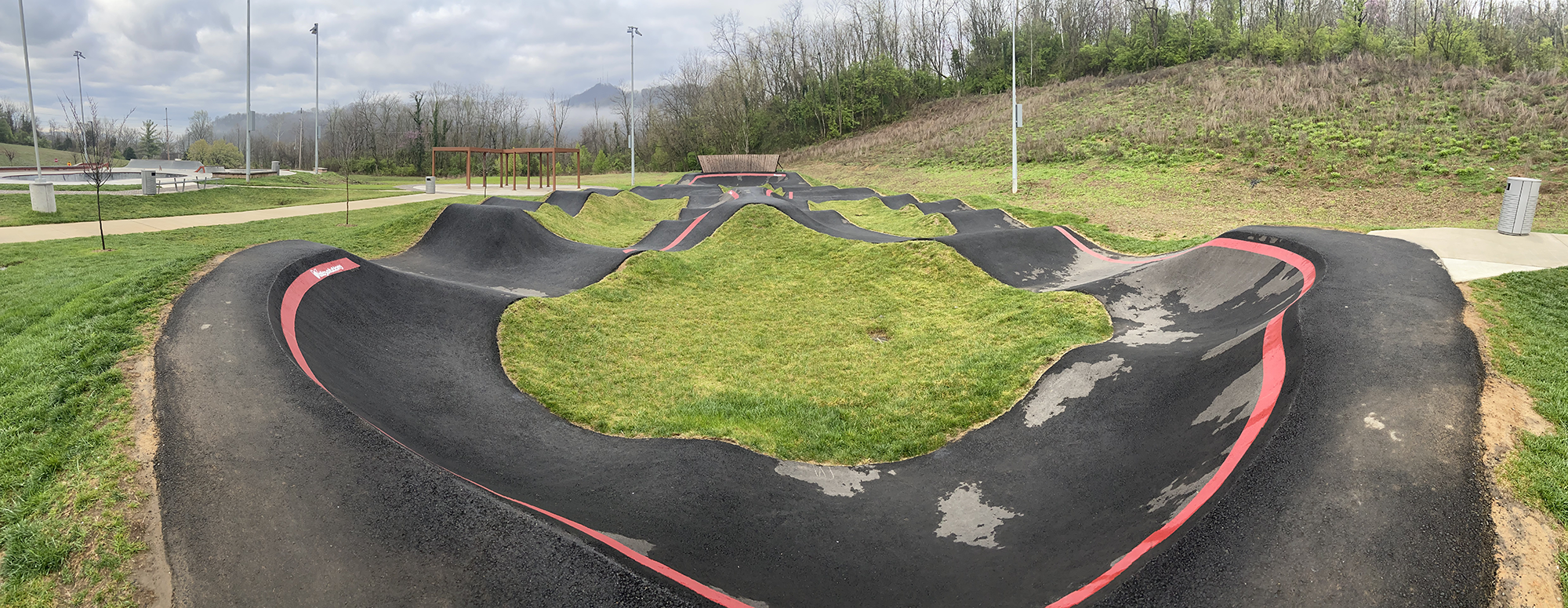
Brickyard Park Pump Track Logo
Kingsport’s newest recreational site, the Brickyard Park Pump Track, needed its own logo, but also needed to fit in with existing branding. Kingsport Parks & Rec requested an edgy, industrial look that would embrace both the history of the site as former General Shale Brick property and the growing Brickyard community.

Kingsport ARTS Logo
Engage Kingsport, a 501(c)3 nonprofit organization, implemented new arts programs and improved existing ones in an initiative they called “Kingsport ARTS.” Their goal was to ensure that everyone in the community has access to and the ability to take part in a variety of arts programming. They wanted a logo for their initiative that captured the creative, fun, and approachable feel of the Kingsport arts community.
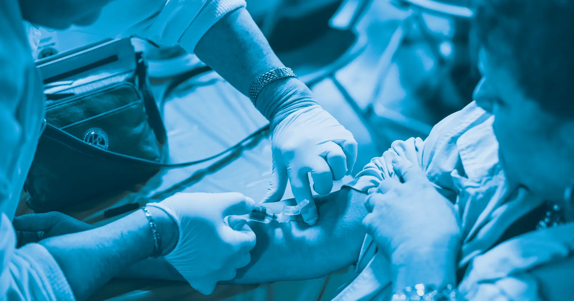
Health Wagon End-of-Year Campaign
The Health Wagon is a nonprofit saving lives in rural Appalachia, offering free health care at mobile and stationary clinics. Their biggest fundraising push is their end-of-year campaign. For their 2022 appeal, it was important to reach potential donors in a variety of ways.

Summit Leadership Capital Campaign
Summit Leadership’s 40,000-square-foot facility offers a space for leaders to gather and work. But the organization saw greater potential that could double or triple their impact. They envisioned spaces that could host everything from small meetings to large galas. To bring their vision into reality, they initiated a capital campaign. And that meant they needed flexible marketing materials to help spread the word.

Trinity Grace Farm Website
When a generous family donated land to Summit Leadership, the goal was to turn these rolling hills and woods into an accessible outdoor venue for people with differing abilities. Summit needed a website to share their vision with the community and to help raise funds for the project, which was named Trinity Grace Farm after the donors’ granddaughter.

People Incorporated Website Redesign
When People Incorporated’s website was ready for an update, we worked closely with them to conduct a content audit, then created a new, more user-friendly site with a fresh look and easier navigation. Our client saw a notable increase in visitor engagement and session duration within the first few months of the relaunch.

Streamworks
When the Tri-Cities TN/VA region was developing its new “STREAMWORKS” program to broaden educational outreach in the areas of science, technology, engineering, arts, and math, they brought us in to assist with branding. We created an interactive brand with elements that are easily incorporated into student work and designed the program’s awards materials.

Virginia Highlands Community College Wolf Logo
After two decades, Virginia Highlands Community College’s iconic wolf logo was ready for a facelift. We created several concepts to help narrow down the look and feel the college’s administration was looking for. With their feedback, we finalized a logo, worked to add visual interest and depth, then created several different lockups for different applications.

Boys & Girls Club of the Mountain Empire Website
Like many nonprofits, the staff and board of directors of the Boys & Girls Club of the Mountain Empire found themselves wearing many hats. They reached out to Hillhouse Creative for assistance with their website. We created a one-page WordPress website, giving the organization the foundation they needed to establish a trusted online presence.

Auros Pharma Website Design
Auros Pharma, a new company developing life-saving solutions to combat the opioid crisis, partnered with us to create a website to house information about their growing lineup of medications that treat a variety of debilitating conditions.

People Incorporated Annual Report
People Inc. wanted to change things up for their 2020 annual report and introduce more color, rethink the presentation of data and develop a theme related to their resiliency and commitment as well as focus on the stories of the people and community empowered by their services.
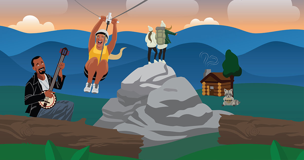
Northeast Tennessee Tourism Association Airport Signage
The Northeast Tennessee Tourism Association (NETTA) needed a way to grab the attention of travelers going through the airport and encourage them to consider Northeast Tennessee for their next day trip or vacation.

People Incorporated Color Refresh
People Incorporated felt that their core and secondary palettes no longer reflected their brand. They came to us for recommendations on an updated color palette that would be flexible, vibrant, and better represent their friendly, helpful, community-oriented personality.
